
JavaScript is required to view this page.
:host {
/* breakpoints: not-implemented / reference only */
/* --shadow-breakpoint-xs: 320px; */
/* --shadow-breakpoint-sm: 490px; */
/* --shadow-breakpoint-md: 768px; */
/* --shadow-breakpoint-lg: 1040px; */
/* --shadow-breakpoint-xl: 1440px; */
--shadow-thumbnail-position-start:
"media gift-dialog-header"
"media content"
"media gift-block-actions";
--shadow-thumbnail-position-end:
"gift-dialog-header media"
"content media"
"gift-block-actions media";
/* border radius */
--shadow-border-radius-xs: calc(var(--shadow-border-radius-scale, 65) / 100 * 1rem);
--shadow-border-radius-sm: calc(var(--shadow-border-radius-scale, 65) / 100 * 1.5rem);
--shadow-border-radius-base: calc(var(--shadow-border-radius-scale, 65) / 100 * 2.5rem);
--shadow-outline-width: calc(var(--shadow-field-border-width) + 0.5px);
/* buttons */
--shadow-hover-style-light: #ffffff;
--shadow-hover-style-dark: #000000;
--shadow-primary-button-surface--active: color-mix(in srgb, var(--shadow-primary-button-surface), var(--shadow-hover-style) 20%);
--shadow-primary-button-surface--hover: color-mix(in srgb, var(--shadow-primary-button-surface), var(--shadow-hover-style) 16%);
--shadow-primary-button-text-color--active: color-mix(in srgb, var(--shadow-primary-button-text-color), var(--shadow-hover-style) 20%);
--shadow-primary-button-text-color--hover: color-mix(in srgb, var(--shadow-primary-button-text-color), var(--shadow-hover-style) 16%);
--shadow-secondary-button-surface--active: color-mix(in srgb, var(--shadow-secondary-button-surface), var(--shadow-hover-style) 20%);
--shadow-secondary-button-surface--hover: color-mix(in srgb, var(--shadow-secondary-button-surface), var(--shadow-hover-style) 16%);
--shadow-secondary-button-text-color--active: color-mix(in srgb, var(--shadow-secondary-button-text-color), var(--shadow-hover-style) 20%);
--shadow-secondary-button-text-color--hover: color-mix(in srgb, var(--shadow-secondary-button-text-color), var(--shadow-hover-style) 16%);
/* do not change the root text size */
--shadow-font-size: 16px;
/* text and fonts */
--shadow-font-size-sm: clamp(12px, calc(14px * var(--shadow-font-scale)), 16px);
--shadow-font-size-base: clamp(12px, calc(16px * var(--shadow-font-scale)), 20px);
--shadow-font-size-lg: clamp(16px, calc(24px * var(--shadow-font-scale)), 28px);
--shadow-font-weight-md: 500;
--shadow-font-weight-lg: 600;
--shadow-line-height-base: 1.5em;
/* transitions */
--shadow-transition-duration: 0.1s;
--shadow-spinner-duration: 0.7s;
/* disabled */
--shadow-disabled-opacity-sm: 0.16;
--shadow-disabled-opacity: 0.32;
--shadow-disabled-opacity-md: 0.4;
--shadow-disabled-opacity-lg: 0.64;
/* precalculated percentages for color-mix */
--shadow-disabled-opacity-percent: 32%;
--shadow-disabled-opacity-sm-percent: 16%;
--shadow-disabled-opacity-md-percent: 40%;
--shadow-disabled-opacity-lg-percent: 64%;
--shadow-disabled-cursor: not-allowed;
/* form elements */
--shadow-form-element-surface--disabled: color-mix(in srgb, var(--shadow-form-element-surface) var(--shadow-disabled-opacity-percent), var(--shadow-secondary-text-color) 8%);
--shadow-form-element-border-color--active: color-mix(in srgb, var(--shadow-form-element-border-color), white 83%);
--shadow-form-element-border-color--disabled: color-mix(in srgb, var(--shadow-form-element-border-color) var(--shadow-disabled-opacity-percent), var(--shadow-secondary-text-color) 8%);
--shadow-form-element-text-color--disabled: color-mix(in srgb, var(--shadow-form-element-text-color), var(--shadow-secondary-text-color) 8%);
--shadow-form-element-placeholder-text-color: color-mix(in srgb, var(--shadow-form-element-text-color) var(--shadow-disabled-opacity-percent), transparent);
--shadow-form-element-placeholder-text-color--disabled: color-mix(in srgb, var(--shadow-form-element-text-color) var(--shadow-disabled-opacity-percent), var(--shadow-secondary-text-color) 8%);
--shadow-form-element-selection-color--active: color-mix(in srgb, var(--shadow-form-element-selection-color), var(--shadow-hover-style) 40%);
--shadow-form-element-selection-color--hover: color-mix(in srgb, var(--shadow-form-element-selection-color), var(--shadow-hover-style) 32%);
/* primary colors */
--shadow-primary-text-color--hover: color-mix(in srgb, var(--shadow-primary-text-color), var(--shadow-hover-style) 32%);
/* secondary colors */
--shadow-secondary-text-color--disabled: color-mix(in srgb, var(--shadow-secondary-text-color) var(--shadow-disabled-opacity-lg-percent), var(--shadow-secondary-text-color) 8%);
/* spacing */
--shadow-spacing-scale-base: 1;
--shadow-spacing-scale-less: 0.75;
--shadow-spacing-scale-more: 1.166;
--shadow-spacing-fixed: 4px;
--shadow-spacing-base: clamp(12px, calc(16px * var(--shadow-spacing-scale)), 24px);
--shadow-spacing-lg: clamp(16px, calc(24px * var(--shadow-spacing-scale)), 28px);
--shadow-spacing-sm: clamp(8px, calc(12px * var(--shadow-spacing-scale)), 14px);
--shadow-spacing-xs: clamp(6px, calc(8px * var(--shadow-spacing-scale)), 10px);
/* inline block */
--shadow-feature-max-height: 500px;
--shadow-textarea-min-height: 80px;
--shadow-block-margin-block-start: calc(1em * var(--shadow-spacing-scale));
--shadow-block-margin-block-end: calc(2em * var(--shadow-spacing-scale));
/* shadows */
--shadow-shadow-blur: 1.5rem;
--shadow-shadow-color: rgba(0, 0, 0, 0.25);
--shadow-shadow-offset: 0.75rem;
/* the default look: what a shop without a presets entry paints; a saved entry overrides these per option type below */
--shadow-font-family: inherit;
--shadow-header-font-family: inherit;
--shadow-font-weight-base: 400;
--shadow-letter-spacing: normal;
--shadow-button-text-transform: none;
--shadow-button-letter-spacing: normal;
--shadow-button-font-style: normal;
--shadow-launcher-button-font-weight: 400;
--shadow-launcher-button-max-width: 500px;
--shadow-launcher-button-alignment: center;
--shadow-launcher-button-content-justify-content: space-between;
--shadow-launcher-button-content-flex-direction: row-reverse;
--shadow-grid-template-areas: var(--shadow-thumbnail-position-start);
--shadow-border-radius-scale: 60;
--shadow-block-border-surface: #00000000;
--shadow-border-width: 1px;
--shadow-field-border-width: var(--shadow-border-width);
--shadow-hover-style: var(--shadow-hover-style-light, --shadow-hover-style-light);
--shadow-launcher-button-surface: #000000;
--shadow-launcher-button-text-color: #ffffff;
--shadow-launcher-button-border-surface: #00000000;
--shadow-primary-button-surface: #000000;
--shadow-primary-button-text-color: #ffffff;
--shadow-primary-button-border-surface: #00000000;
--shadow-primary-button-border-surface--active: transparent;
--shadow-primary-button-border-surface--hover: transparent;
--shadow-secondary-button-surface: #0000000f;
--shadow-secondary-button-text-color: #333333;
--shadow-secondary-button-border-surface: #00000000;
--shadow-secondary-button-border-surface--active: transparent;
--shadow-secondary-button-border-surface--hover: transparent;
--shadow-font-scale: calc(100 / 100);
--shadow-form-element-surface: #ffffff;
--shadow-form-element-border-color: #0000000f;
--shadow-form-element-text-color: #333333;
--shadow-form-element-selection-color: #000000;
--shadow-selection-accent-color: var(--shadow-form-element-selection-color);
--shadow-selection-checked-surface: var(--shadow-form-element-selection-color);
--shadow-selection-swatch-color: var(--shadow-form-element-selection-color);
--shadow-primary-surface: #ffffff;
--shadow-primary-text-color: #000000;
--shadow-secondary-surface: #f3f3f3;
--shadow-secondary-text-color: #333333;
--shadow-spacing-scale: var(--shadow-spacing-scale-base, 1);
--shadow-gift-thumbnail-size: 60px;
--shadow-thumbnail-size: clamp(40px, var(--shadow-gift-thumbnail-size), 200px);
--shadow-thumbnail-flex-direction: row;
--shadow-thumbnail-order: -1;
--shadow-thumbnail-margin-left: 0;
--shadow-thumbnail-margin-right: 0.6em;
--shadow-block-padding: var(--shadow-block-padding-block-start, var(--shadow-spacing-sm)) var(--shadow-block-padding-inline-end, var(--shadow-spacing-sm)) var(--shadow-block-padding-block-end, var(--shadow-spacing-sm)) var(--shadow-block-padding-inline-start, var(--shadow-spacing-sm));
/* default styles */
all: revert;
box-sizing: border-box;
cursor: default;
display: block;
font-family: var(--shadow-font-family);
font-size: var(--shadow-font-size);
line-height: var(--shadow-line-height-base);
letter-spacing: var(--shadow-letter-spacing);
margin-block-start: var(--shadow-block-margin-start, var(--shadow-spacing-xs)) !important;
margin-block-end: var(--shadow-block-margin-end, var(--shadow-spacing-xs)) !important;
margin-inline-start: var(--shadow-block-margin-inline-start, 0) !important;
margin-inline-end: var(--shadow-block-margin-inline-end, 0) !important;
text-align: start;
width: -webkit-fill-available;
white-space: normal;
}
:host([option-type="product"]) {
--shadow-font-family: inherit;
--shadow-header-font-family: inherit;
--shadow-font-weight-base: 400;
--shadow-letter-spacing: normal;
--shadow-button-text-transform: none;
--shadow-button-letter-spacing: normal;
--shadow-button-font-style: normal;
--shadow-launcher-button-font-weight: 400;
--shadow-launcher-button-max-width: 500px;
--shadow-launcher-button-alignment: center;
--shadow-launcher-button-content-justify-content: space-between;
--shadow-launcher-button-content-flex-direction: row-reverse;
--shadow-grid-template-areas: var(--shadow-thumbnail-position-start);
/* border radius */
--shadow-border-radius-scale: 60;
--shadow-block-border-surface: #00000000;
--shadow-border-width: 1px;
/* buttons */
--shadow-hover-style: var(--shadow-hover-style-light, --shadow-hover-style-light);
--shadow-launcher-button-surface: #333333;
--shadow-launcher-button-text-color: #ffffff;
--shadow-launcher-button-border-surface: #00000000;
--shadow-primary-button-surface: #333333;
--shadow-primary-button-text-color: #ffffff;
--shadow-primary-button-border-surface: #00000000;
--shadow-primary-button-border-surface--active: transparent;
--shadow-primary-button-border-surface--hover: transparent;
--shadow-secondary-button-surface: #0000000f;
--shadow-secondary-button-text-color: #333333;
--shadow-secondary-button-border-surface: #00000000;
--shadow-secondary-button-border-surface--active: transparent;
--shadow-secondary-button-border-surface--hover: transparent;
/* text and fonts */
--shadow-font-scale: calc(100 / 100);
/* form elements */
--shadow-form-element-surface: #ffffff;
--shadow-form-element-border-color: #0000000f;
--shadow-form-element-text-color: #333333;
--shadow-form-element-selection-color: #232323;
--shadow-selection-accent-color: var(--shadow-form-element-selection-color);
--shadow-selection-checked-surface: var(--shadow-form-element-selection-color);
--shadow-selection-swatch-color: var(--shadow-form-element-selection-color);
/* primary colors */
--shadow-primary-surface: #ffffff;
--shadow-primary-text-color: #232323;
/* secondary colors */
--shadow-secondary-surface: #f3f3f3;
--shadow-secondary-text-color: #333333;
/* spacing */
--shadow-spacing-scale: var(--shadow-spacing-scale-base, 1);
/* media */
--shadow-gift-thumbnail-size: 60px;
--shadow-thumbnail-size: clamp(40px, var(--shadow-gift-thumbnail-size), 200px);
--shadow-thumbnail-flex-direction: row;
--shadow-thumbnail-order: -1;
--shadow-thumbnail-margin-left: 0;
--shadow-thumbnail-margin-right: 0.6em;
}
:host([option-type="order"]) {
--shadow-font-family: inherit;
--shadow-header-font-family: inherit;
--shadow-font-weight-base: 400;
--shadow-letter-spacing: normal;
--shadow-button-text-transform: none;
--shadow-button-letter-spacing: normal;
--shadow-button-font-style: normal;
--shadow-launcher-button-font-weight: 400;
--shadow-launcher-button-max-width: 500px;
--shadow-launcher-button-alignment: center;
--shadow-launcher-button-content-justify-content: space-between;
--shadow-launcher-button-content-flex-direction: row-reverse;
--shadow-grid-template-areas: var(--shadow-thumbnail-position-start);
/* border radius */
--shadow-border-radius-scale: 60;
--shadow-block-border-surface: #00000000;
--shadow-border-width: 1px;
/* buttons */
--shadow-hover-style: var(--shadow-hover-style-light, --shadow-hover-style-light);
--shadow-launcher-button-surface: #333333;
--shadow-launcher-button-text-color: #ffffff;
--shadow-launcher-button-border-surface: #00000000;
--shadow-primary-button-surface: #333333;
--shadow-primary-button-text-color: #ffffff;
--shadow-primary-button-border-surface: #00000000;
--shadow-primary-button-border-surface--active: transparent;
--shadow-primary-button-border-surface--hover: transparent;
--shadow-secondary-button-surface: #0000000f;
--shadow-secondary-button-text-color: #333333;
--shadow-secondary-button-border-surface: #00000000;
--shadow-secondary-button-border-surface--active: transparent;
--shadow-secondary-button-border-surface--hover: transparent;
/* text and fonts */
--shadow-font-scale: calc(100 / 100);
/* form elements */
--shadow-form-element-surface: #ffffff;
--shadow-form-element-border-color: #0000000f;
--shadow-form-element-text-color: #333333;
--shadow-form-element-selection-color: #232323;
--shadow-selection-accent-color: var(--shadow-form-element-selection-color);
--shadow-selection-checked-surface: var(--shadow-form-element-selection-color);
--shadow-selection-swatch-color: var(--shadow-form-element-selection-color);
/* primary colors */
--shadow-primary-surface: #ffffff;
--shadow-primary-text-color: #232323;
/* secondary colors */
--shadow-secondary-surface: #f3f3f3;
--shadow-secondary-text-color: #333333;
/* spacing */
--shadow-spacing-scale: var(--shadow-spacing-scale-base, 1);
/* media */
--shadow-gift-thumbnail-size: 60px;
--shadow-thumbnail-size: clamp(40px, var(--shadow-gift-thumbnail-size), 200px);
--shadow-thumbnail-flex-direction: row;
--shadow-thumbnail-order: -1;
--shadow-thumbnail-margin-left: 0;
--shadow-thumbnail-margin-right: 0.6em;
}
*,
*::before,
*::after {
box-sizing: border-box;
}
.gift-block__launcher .icon-wrapper svg,
:host(wrapped-extension) gift-block-launcher [part="container"] label svg,
:host(wrapped-extension) [feature="gift-option"] [part="container"] label svg,
:host(wrapped-gift-block) gift-block-option-heading label svg {
box-sizing: border-box;
border: calc(var(--shadow-field-border-width) + 0.5px) solid;
border-radius: max(0px, calc(min(0.20625em, var(--shadow-border-radius-sm)) + min(var(--shadow-border-radius-sm) * 1000, var(--shadow-field-border-width) - 1px)));
height: calc(var(--shadow-font-size-base) * 0.7875 + 3.5 * var(--shadow-field-border-width) - 0.5px);
overflow: visible;
width: calc(var(--shadow-font-size-base) * 0.7875 + 3.5 * var(--shadow-field-border-width) - 0.5px);
}
.checkmark-icon {
fill: none;
stroke-linecap: var(--shadow-tick-cap, round);
stroke-linejoin: var(--shadow-tick-join, round);
stroke-width: 1.5px;
}
gift-block-launcher:not([variant="inline"]) {
display: flex;
flex-direction: column;
gap: var(--shadow-spacing-xs);
align-items: var(--shadow-launcher-button-alignment);
& gift-block-visibility-notice {
display: block;
font-family: var(--shadow-font-family);
font-size: smaller;
font-weight: var(--shadow-font-weight-base);
font-style: var(--shadow-button-font-style);
letter-spacing: var(--shadow-button-letter-spacing);
padding: 0 var(--shadow-block-padding-inline-end, var(--shadow-spacing-sm)) 0 var(--shadow-block-padding-inline-start, var(--shadow-spacing-sm));
text-transform: var(--shadow-button-text-transform);
width: 100%;
}
}
.gift-block__launcher {
background-color: var(--shadow-launcher-button-surface);
border-color: var(--shadow-launcher-button-border-surface);
border-width: var(--shadow-launcher-button-border-width, var(--shadow-border-width));
border-radius: var(--shadow-launcher-button-border-radius, var(--shadow-border-radius-sm));
border-style: solid;
color: var(--shadow-launcher-button-text-color);
padding: var(--shadow-block-padding);
font-family: var(--shadow-font-family);
font-size: var(--shadow-font-size-base);
font-weight: var(--shadow-launcher-button-font-weight);
font-style: var(--shadow-button-font-style);
letter-spacing: var(--shadow-button-letter-spacing);
max-width: var(--shadow-block-launcher-button-max-width, var(--shadow-launcher-button-max-width));
text-transform: var(--shadow-button-text-transform);
width: 100%;
&:hover {
cursor: pointer;
background-color: var(--shadow-primary-button-surface--hover);
border-color: var(--shadow-primary-button-border-surface--hover);
}
&:active {
background-color: var(--shadow-primary-button-surface--active);
border-color: var(--shadow-primary-button-border-surface--active);
}
&:focus,
&:focus-visible {
outline: none;
}
&[with-checkmark] {
position: relative;
display: inline-flex;
align-items: center;
gap: var(--shadow-spacing-fixed);
& .icon-wrapper {
display: flex;
flex-shrink: 0;
}
&[with-gift-options] {
.checkmark-icon {
display: block;
/* animation: unblur calc(var(--shadow-transition-duration) * 3) ease forwards; */
}
}
}
&[variant="link"] {
background: none;
border: none;
color: var(--shadow-primary-text-color);
font-size: var(--shadow-font-size-base);
font-weight: var(--shadow-font-weight-base);
font-style: var(--shadow-button-font-style);
letter-spacing: var(--shadow-button-letter-spacing);
text-transform: var(--shadow-button-text-transform);
text-decoration: none;
margin-inline-start: -0.25rem;
padding: var(--shadow-block-padding-block-start, 0) var(--shadow-block-padding-inline-end, 0) var(--shadow-block-padding-block-end, 0) var(--shadow-block-padding-inline-start, 0);
width: auto;
&:hover {
cursor: pointer;
color: var(--shadow-primary-text-color--hover);
text-decoration: underline;
}
&[with-checkmark] {
padding-left: 0;
text-align: start;
word-break: keep-all;
}
& .button-content {
flex-direction: row;
justify-content: flex-start;
}
}
& .button-content {
display: inline-flex;
align-items: center;
gap: var(--shadow-spacing-fixed);
flex-direction: var(--shadow-launcher-button-content-flex-direction);
justify-content: var(--shadow-launcher-button-content-justify-content);
width: 100%;
& .label {
text-align: start;
}
}
& .icon-wrapper {
display: none;
align-items: center;
justify-content: center;
min-height: 1.5em;
min-width: 1.5em;
svg {
border-color: currentColor;
}
.checkmark-icon {
display: none;
stroke: currentColor;
}
}
}
.gift-block__launcher:disabled,
.gift-block__launcher[usage-limit-reached],
.gift-block__launcher[region-unavailable] {
cursor: var(--shadow-disabled-cursor);
opacity: var(--shadow-disabled-opacity);
pointer-events: none;
&[with-checkmark] {
.icon-wrapper {
opacity: var(--shadow-disabled-opacity-md);
}
}
}
/* gift block modal */
.gift-block-modal {
background-color: var(--shadow-primary-surface);
border: none;
border-radius: var(--shadow-border-radius-base);
box-shadow: 0 var(--shadow-shadow-offset) var(--shadow-shadow-blur) var(--shadow-shadow-color);
outline: var(--shadow-border-width) solid var(--shadow-block-border-surface);
padding: 0;
}
.gift-block-modal::backdrop {
background-color: rgba(156, 163, 175, 0.75);
}
.gift-block-modal:focus,
.gift-block-modal:focus-visible {
outline: var(--shadow-border-width) solid var(--shadow-block-border-surface);
}
@media (max-width: 768px) {
.gift-block-modal {
max-height: calc(100% - var(--shadow-spacing-sm));
max-width: calc(100% - var(--shadow-spacing-sm));
overscroll-behavior: contain;
}
}
/* gift block modal layout */
.gift-block-modal-layout {
display: grid;
grid-template-areas: var(--shadow-grid-template-areas);
grid-template-columns: 1fr 1fr;
grid-template-rows: auto 1fr auto;
max-height: 80dvh;
max-width: 80dvw;
overflow: hidden;
}
/* Collapse to 1-column layout if media is hidden */
.gift-block-modal-layout:has(section#media[hidden]),
.gift-block-modal-layout:has(section#media.with-media-inline),
.gift-block-modal-layout:not(:has(section#media)),
.gift-block-modal-layout:not(:has(section#media img)) {
grid-template-areas:
"gift-dialog-header"
"content"
"gift-block-actions";
grid-template-columns: 1fr;
grid-template-rows: auto 1fr auto;
section#media {
display: none;
}
}
gift-dialog-header {
align-items: flex-start;
background-color: var(--shadow-primary-surface);
display: flex;
flex-direction: row;
gap: var(--shadow-spacing-fixed);
grid-area: gift-dialog-header;
justify-content: space-between;
padding: var(--shadow-spacing-lg);
position: sticky;
top: 0;
z-index: 1;
& h1 {
color: var(--shadow-primary-text-color);
font-family: var(--shadow-header-font-family);
font-size: var(--shadow-font-size-lg);
font-weight: var(--shadow-font-weight-md);
line-height: 1.25em;
margin: 0;
}
/* dismiss button styles */
& button {
background-color: color-mix(in srgb, var(--shadow-secondary-text-color) 8%, transparent);
color: var(--shadow-secondary-text-color);
border-radius: var(--shadow-border-radius-xs);
font-size: var(--shadow-font-size-sm);
font-weight: var(--shadow-font-weight-lg);
font-style: var(--shadow-button-font-style);
letter-spacing: var(--shadow-button-letter-spacing);
text-transform: var(--shadow-button-text-transform);
width: 2.25em;
height: 2.25em;
min-width: 2.25em;
min-height: 2.25em;
outline: none;
border: 0;
cursor: pointer;
transition: background-color var(--shadow-transition-duration) ease,
color var(--shadow-transition-duration) ease;
&:hover {
background-color: color-mix(in srgb, var(--shadow-secondary-text-color) 6%, var(--shadow-hover-style) 12%);
}
&:active {
background-color: color-mix(in srgb, var(--shadow-secondary-text-color) 16%, var(--shadow-hover-style) 16%);
}
&:disabled {
pointer-events: none;
opacity: var(--shadow-disabled-opacity);
}
}
}
.gift-block-modal-layout gift-block-actions {
background-color: var(--shadow-primary-surface);
bottom: 0;
grid-area: gift-block-actions;
overscroll-behavior: contain;
position: sticky;
z-index: 1;
/* the buttons live in the component's own shadow; only its layout knobs are ours */
--shadow-actions-gap: var(--shadow-spacing-sm);
--shadow-actions-padding: var(--shadow-spacing-lg);
}
gift-dialog-content {
display: contents;
}
section#media {
align-self: stretch;
background-color: var(--shadow-secondary-surface);
grid-area: media;
grid-row: 1 / 4;
height: 100%;
padding: var(--shadow-spacing-lg);
position: sticky;
top: 0;
transition: order var(--shadow-transition-duration) ease,
width var(--shadow-transition-duration) ease;
&.with-media-cover {
& img {
height: 100%;
}
}
&.with-media-fill {
padding: 0;
& img {
border-radius: 0;
height: 100%;
}
}
& shopify-media {
& img {
border-radius: var(--shadow-border-radius-sm);
width: 100%;
height: auto;
}
}
}
section#content {
grid-area: content;
background-color: var(--shadow-primary-surface);
overflow-y: auto;
overscroll-behavior: contain;
scrollbar-width: thin;
-webkit-overflow-scrolling: touch;
padding: var(--shadow-spacing-lg);
padding-bottom: 0;
padding-top: 0;
position: relative; /* important to prevent content shifting when changing variants */
align-items: stretch;
display: flex;
flex-direction: column;
justify-content: flex-start;
gap: var(--shadow-spacing-lg);
transition: order var(--shadow-transition-duration) ease;
@media (max-width: 768px) {
& > *:first-child:not(:only-child) {
margin-top: unset;
}
}
& gift-block-option-heading {
display: block;
& span[part="label"] {
color: var(--shadow-primary-text-color);
display: block;
font-size: var(--shadow-font-size-base);
font-weight: var(--shadow-font-weight-md, 500);
line-height: 1.25em;
}
}
& .gift-option-group {
display: flex;
flex-direction: column;
gap: var(--shadow-spacing-lg);
}
/* gift product details */
& .gift-product {
display: flex;
flex-direction: column;
gap: var(--shadow-spacing-base);
}
& .gift-product-header {
align-items: center;
display: flex;
flex-direction: var(--shadow-thumbnail-flex-direction);
flex-wrap: wrap;
row-gap: var(--shadow-spacing-base);
column-gap: var(--shadow-spacing-sm);
}
& .gift-product-content {
display: flex;
flex: 1 1 50%;
flex-direction: column;
gap: var(--shadow-spacing-xs);
}
& .gift-product-media {
display: flex;
align-items: center;
&:has(shopify-media) {
--shadow-inline-media-max-size: var(--shadow-gift-thumbnail-size);
--shadow-inline-media-size: clamp(40px, var(--shadow-gift-thumbnail-size), var(--shadow-inline-media-max-size));
border-radius: var(--shadow-border-radius-sm);
height: var(--shadow-inline-media-size);
width: var(--shadow-inline-media-size);
overflow: hidden;
margin-inline-start: auto;
margin-inline-end: auto;
}
& shopify-media {
& img {
border-radius: var(--shadow-border-radius-sm);
width: 100%;
height: auto;
}
}
}
& .gift-product-title {
color: var(--shadow-primary-text-color);
display: var(--shadow-gift-product-title-display, block);
font-size: var(--shadow-font-size-base);
font-weight: var(--shadow-font-weight-md);
margin: 0;
}
& .gift-product-pricing {
display: flex;
gap: var(--shadow-spacing-xs);
margin: 0;
font-weight: var(--shadow-font-weight-base);
font-size: clamp(12px, calc(var(--shadow-font-size-base) * 0.94), 18px);
line-height: 1em;
}
& .gift-product-price {
color: var(--shadow-secondary-text-color);
}
& .gift-product-price--compare {
color: var(--shadow-secondary-text-color);
text-decoration: line-through;
opacity: var(--shadow-disabled-opacity);
}
& .gift-product-description {
font-weight: var(--shadow-font-weight-base);
color: var(--shadow-secondary-text-color);
font-size: clamp(12px, calc(var(--shadow-font-size-base) * 0.94), 18px);
line-height: 1.5em;
& shopify-data {
& :first-child {
margin-top: 0;
}
& :last-child {
margin-bottom: 0;
}
& ul {
padding-left: var(--shadow-spacing-lg);
}
}
}
}
:host(wrapped-gift-block) gift-block-option-heading label {
align-items: center;
cursor: pointer;
display: flex;
gap: var(--shadow-spacing-sm);
}
:host(wrapped-gift-block[gift-option-optional]) section#content .gift-option-group {
border-radius: var(--shadow-border-radius-sm);
position: relative;
}
:host(wrapped-gift-block[gift-option-optional]:not([gift-option-included])) section#content .gift-option-group {
pointer-events: none;
}
:host(wrapped-gift-block[gift-option-optional]:not([gift-option-included])) section#content .gift-option-group::after {
background-color: color-mix(in srgb, var(--shadow-primary-surface) 62%, transparent);
border-radius: inherit;
content: '';
inset: calc(var(--shadow-spacing-sm) * -1);
position: absolute;
}
/* shopify variant selector */
:host(wrapped-extension) gift-variant-selector {
--shadow-picker-padding: var(--shadow-block-padding-block-start, var(--shadow-spacing-sm)) var(--shadow-block-padding-inline-end, var(--shadow-spacing-base)) var(--shadow-block-padding-block-end, var(--shadow-spacing-sm)) var(--shadow-block-padding-inline-start, var(--shadow-spacing-base));
--shadow-picker-rows-padding: var(--shadow-block-padding);
}
:host(wrapped-extension[saving="true"]) gift-variant-selector {
--shadow-picker-opacity: 0.7;
--shadow-picker-pointer-events: none;
}
:host(wrapped-gift-block[gift-option-optional]:not([gift-option-included])) gift-variant-selector {
--shadow-picker-selection-color: var(--shadow-form-element-border-color);
--shadow-picker-selection-width: var(--shadow-field-border-width);
--shadow-picker-swatch-selection-color: rgba(0, 0, 0, .1);
}
:host(wrapped-extension[gift-option-optional="true"]:not([gift-option-included])) gift-variant-selector,
:host(wrapped-gift-block[gift-option-optional="true"]:not([gift-option-included])) gift-variant-selector {
--shadow-picker-card-accent: color-mix(in srgb, var(--shadow-form-element-border-color) 25%, transparent);
--shadow-picker-card-opacity: 0.8;
--shadow-picker-card-ring: transparent;
--shadow-picker-radio-appearance: none;
--shadow-picker-radio-border: var(--shadow-field-border-width) solid var(--shadow-form-element-border-color);
--shadow-picker-radio-surface: var(--shadow-form-element-surface);
--shadow-picker-row-shadow: none;
--shadow-picker-row-surface: initial;
}
wrapped-message-field {
gap: var(--shadow-spacing-xs);
& label {
color: var(--shadow-secondary-text-color);
font-size: var(--shadow-font-size-sm);
font-weight: var(--shadow-font-weight-base);
line-height: 1em;
}
& :is(input, textarea) {
background-color: var(--shadow-form-element-surface);
border: none;
border-radius: var(--shadow-border-radius-sm);
color: var(--shadow-form-element-text-color);
font-family: var(--shadow-font-family);
font-size: var(--shadow-font-size-base);
margin: 0;
min-height: 42px;
outline: var(--shadow-field-border-width) solid var(--shadow-form-element-border-color);
padding: var(--shadow-spacing-sm);
width: 100%;
}
& :is(input, textarea):is(:active, :focus, :focus-visible) {
outline-color: var(--shadow-form-element-selection-color);
outline-width: var(--shadow-outline-width);
}
& :is(input, textarea)::placeholder {
color: var(--shadow-form-element-placeholder-text-color);
}
& textarea {
min-height: 100px;
resize: vertical;
}
& span.counter {
align-self: flex-end;
color: var(--shadow-secondary-text-color);
font-size: var(--shadow-font-size-sm);
line-height: normal;
}
}
wrapped-message-field[disabled] {
cursor: var(--shadow-disabled-cursor);
opacity: var(--shadow-disabled-opacity-md);
pointer-events: none;
transition: background-color var(--shadow-transition-duration) ease,
color var(--shadow-transition-duration) ease;
& :is(input, textarea) {
background-color: var(--shadow-form-element-surface--disabled);
color: transparent;
outline-color: var(--shadow-form-element-border-color--disabled);
}
}
:host(wrapped-extension) {
background-color: var(--shadow-primary-surface) !important;
border: var(--shadow-border-width) solid var(--shadow-block-border-surface) !important;
border-radius: var(--shadow-border-radius-sm) !important;
color: var(--shadow-primary-text-color) !important;
display: flex;
flex-direction: column !important;
font-size: var(--shadow-font-size-base) !important;
height: fit-content !important;
margin-block-start: var(--shadow-block-margin-start, var(--shadow-block-margin-block-start)) !important;
margin-block-end: var(--shadow-block-margin-end, var(--shadow-block-margin-block-end)) !important;
min-width: unset !important;
max-width: 640px !important;
overflow: hidden !important;
padding: unset !important;
width: unset !important;
}
:host(wrapped-extension[option-type="order"]) {
margin-left: var(--shadow-block-margin-inline-start, auto) !important;
margin-right: var(--shadow-block-margin-inline-end, 0) !important;
width: -moz-available !important;
width: -webkit-fill-available !important;
width: stretch !important;
}
:host(wrapped-extension[target-group="drawer"]) {
width: -moz-available !important;
width: -webkit-fill-available !important;
width: stretch !important;
}
:host(wrapped-extension[target-group="drawer"][option-type="order"]) {
max-width: unset !important;
margin-left: var(--shadow-block-margin-inline-start, 0) !important;
margin-right: var(--shadow-block-margin-inline-end, 0) !important;
margin-block-end: var(--shadow-block-margin-end, calc(var(--shadow-block-margin-block-end) * 0.5)) !important;
}
wrapped-advanced-mode,
wrapped-basic-mode {
display: contents;
}
:host(wrapped-extension) [part="feature"],
:host(wrapped-extension) gift-block-launcher {
overflow: hidden !important;
& [part="container"] {
display: flex;
flex-direction: column;
row-gap: 0.25em;
& label {
align-items: center !important;
column-gap: var(--shadow-spacing-sm) !important;
cursor: pointer !important;
display: flex;
line-height: normal !important;
margin: 0 !important;
pointer-events: auto !important;
text-align: left !important;
text-transform: unset !important;
}
}
}
:host(wrapped-extension) [part="feature"] {
background-color: var(--shadow-secondary-surface);
}
:host(wrapped-extension) [part="feature"]:is([feature="variant"], [feature="gift-option"]) {
display: block;
}
:host(wrapped-extension) [part="feature"][enabled="false"] {
display: none;
opacity: 0;
visibility: hidden;
}
:host(wrapped-extension) [part="disclosure"] {
display: grid;
grid-template-rows: 0fr;
transition: grid-template-rows 0.25s cubic-bezier(0.42, 0, 0.58, 1);
}
:host(wrapped-extension) [part="disclosure-content"] {
display: flex;
flex-direction: column;
min-height: 0;
opacity: 0;
overflow: hidden;
visibility: hidden;
transition: opacity 0.25s, visibility 0.25s;
}
:host(wrapped-extension[expanded="true"]) gift-block-launcher:has(~ [part="disclosure"] [part="feature"][enabled="true"]:not([singular="true"])) {
border-bottom: var(--shadow-border-width) solid var(--shadow-block-border-surface);
}
:host(wrapped-extension[expanded="true"]) [part="disclosure"],
:host(wrapped-extension[hidden-checkbox="true"]) [part="disclosure"] {
grid-template-rows: 1fr;
}
:host(wrapped-extension[expanded="true"]) [part="disclosure-content"],
:host(wrapped-extension[hidden-checkbox="true"]) [part="disclosure-content"] {
opacity: 1;
visibility: visible;
}
:host(wrapped-extension[hidden-checkbox="true"]) gift-block-launcher {
display: none;
opacity: 0;
visibility: hidden;
}
:host(wrapped-extension[limited="true"]),
:host(wrapped-extension[region-unavailable="true"]) {
cursor: none !important;
pointer-events: none !important;
opacity: 0.6 !important;
& [part="container"] {
& label {
pointer-events: none !important;
}
}
}
:host(wrapped-extension[saving="true"]) {
& [part="container"] {
& label {
pointer-events: none !important;
& svg, input[type="radio"], span {
opacity: 0.7 !important;
transition: opacity 300ms cubic-bezier(0.25, 0.1, 0.25, 1);
}
}
& select {
pointer-events: none !important;
opacity: 0.7 !important;
}
& button {
pointer-events: none;
opacity: 0.7;
transition: opacity 300ms cubic-bezier(0.25, 0.1, 0.25, 1);
}
}
}
:host(wrapped-extension) gift-block-launcher [part="container"] {
padding: var(--shadow-block-padding);
& label {
padding: 0 !important;
& span {
&[part="label"] {
border: unset !important;
flex-grow: 1;
padding: unset !important;
}
&[part="pricing"] {
align-content: center;
font-size: var(--shadow-font-size-sm);
white-space: nowrap;
}
&[part="thumbnail"] {
background-color: var(--shadow-form-element-surface);
background-size: cover;
background-position: center;
background-repeat: no-repeat;
border-radius: var(--shadow-border-radius-sm);
min-height: var(--shadow-thumbnail-size);
max-height: var(--shadow-thumbnail-size);
min-width: var(--shadow-thumbnail-size);
max-width: var(--shadow-thumbnail-size);
height: 100%;
width: 100%;
display: inline-block;
overflow: hidden;
vertical-align: middle;
order: var(--shadow-thumbnail-order);
margin-right: var(--shadow-thumbnail-margin-right);
margin-left: var(--shadow-thumbnail-margin-left);
}
}
}
}
:host(wrapped-extension) [feature="gift-option"] [part="container"] {
padding: var(--shadow-block-padding);
& label {
align-items: center;
cursor: pointer;
display: flex;
gap: var(--shadow-spacing-sm);
}
& span[part="label"] {
color: var(--shadow-primary-text-color);
display: block;
font-size: var(--shadow-font-size-base);
font-weight: var(--shadow-font-weight-md, 500);
line-height: 1.25em;
}
}
:host(wrapped-extension) gift-block-launcher [part="container"] label,
:host(wrapped-extension) [feature="gift-option"] [part="container"] label,
:host(wrapped-gift-block) gift-block-option-heading label {
position: relative;
& input[type="checkbox"] {
height: 1px;
margin: 0;
opacity: 0;
pointer-events: none;
position: absolute;
width: 1px;
}
& svg {
background: var(--shadow-form-element-surface);
border-color: var(--shadow-form-element-border-color);
cursor: pointer;
flex: 0 0 auto;
& .checkmark-icon {
display: none;
}
}
& input:checked + svg {
background: var(--shadow-selection-checked-surface);
border-color: var(--shadow-selection-checked-surface);
& .checkmark-icon {
display: block;
stroke: white;
}
}
& input:focus-visible + svg {
outline: var(--shadow-outline-width) solid var(--shadow-form-element-selection-color);
outline-offset: var(--shadow-field-border-width);
}
}
:host(wrapped-extension[hidden-checkbox="false"][gift-option-optional="false"]) [feature="variant"][enabled="true"][singular="true"] {
display: none;
}
:host(wrapped-extension[gift-option-optional="true"]) .gift-option-group {
transition: opacity 0.25s cubic-bezier(0.42, 0, 0.58, 1);
}
:host(wrapped-extension[gift-option-optional="true"]:not([gift-option-included])) .gift-option-group {
opacity: 0.5;
pointer-events: none;
}
:host(wrapped-extension[gift-option-optional="true"]) [feature="variant"][singular="true"] gift-variant-selector {
--shadow-picker-list-overflow: auto;
}
:host(wrapped-extension) gift-block-message {
--shadow-message-gap: var(--shadow-spacing-sm);
--shadow-message-padding: var(--shadow-block-padding);
--shadow-message-input-flex: 1 1 40%;
& wrapped-message-field {
& label {
color: var(--shadow-primary-text-color);
}
& textarea {
min-height: var(--shadow-textarea-min-height);
}
}
}
:host(wrapped-extension) gift-block-actions {
--shadow-actions-gap: var(--shadow-spacing-xs);
--shadow-actions-padding: var(--shadow-block-padding);
}
/* media queries */
/* md - and above */
@media (min-width: 768px) {
:host {
--shadow-section-max-width: 420px;
}
gift-dialog-content > section {
min-width: var(--shadow-section-max-width);
max-width: var(--shadow-section-max-width);
}
gift-dialog-header,
.gift-block-modal-layout gift-block-actions {
min-width: var(--shadow-section-max-width);
max-width: var(--shadow-section-max-width);
}
}
/* md - and below */
@media (max-width: 768px) {
:host {
--shadow-section-max-width: 390px;
}
gift-dialog-content > section {
min-width: var(--shadow-section-max-width);
max-width: var(--shadow-section-max-width);
}
gift-dialog-header,
.gift-block-modal-layout gift-block-actions {
min-width: var(--shadow-section-max-width);
max-width: var(--shadow-section-max-width);
}
gift-dialog-header {
padding: var(--shadow-spacing-base);
}
.gift-block-modal-layout gift-block-actions {
--shadow-actions-padding: var(--shadow-spacing-base);
}
.gift-block-modal-layout {
grid-template-areas:
"gift-dialog-header"
"media"
"content"
"gift-block-actions";
grid-template-columns: 1fr;
grid-template-rows: auto auto 1fr auto;
max-height: calc(100dvh - var(--shadow-spacing-base));
max-width: 100dvw;
}
gift-dialog-content {
display: grid;
grid-template-areas:
"media"
"content";
grid-template-columns: 1fr;
grid-template-rows: auto 1fr;
overflow-y: auto;
overscroll-behavior: contain;
scrollbar-width: thin;
-webkit-overflow-scrolling: touch;
}
section#media {
background: none;
grid-row: auto;
position: relative;
padding: 0;
& shopify-media {
& img {
border-radius: unset;
min-height: var(--shadow-section-max-width);
max-height: var(--shadow-section-max-width);
}
}
}
section#content {
overflow-y: unset;
padding: var(--shadow-spacing-base);
&.with-media-inline {
padding-top: 0;
}
& .gift-product-media {
&:has(shopify-media) {
--shadow-inline-media-max-size: 330px;
}
}
}
}
/* sm - and below */
@media (max-width: 480px) {
:host {
--shadow-section-max-width: 100%;
}
section#media {
& shopify-media {
& img {
border-radius: unset;
min-height: 350px;
max-height: 350px;
}
}
}
}
@keyframes unblur {
from { filter: blur(2px); }
to { filter: blur(0px); }
}
Skip to content
my go-to watercolor paint colors + palette
April 8, 2021
The more I paint, the more I realize I have go-to colors I reach for again and again. Instead of having tons of paints in a palette that don't ever get touched, I decided to streamline my colors and just add the ones I regularly use.
There are so many different options for watercolor paints at all different price points and I always recommend just starting with either what you already have on hand or picking up the best quality set you can find in your price range. I have a few of my favorite beginner sets picked out for you on the
Watercolor Supplies page .
I painted with an inexpensive set of cake watercolors for
years before switching to tubes. Tubes of paint are more expensive, but also more saturated, better quality paints that offer truer colors, better translucency, and mix well. I paint pretty much exclusively with tube paints now. I mainly reach for Winsor and Newton and Holbein. I haven't done a ton of experimenting with different brands and qualities of paints, but I can say I'm really happy with the professional grades of both of these brands.
I thought it would be fun to share with you the exact colors I use and how I set it up!
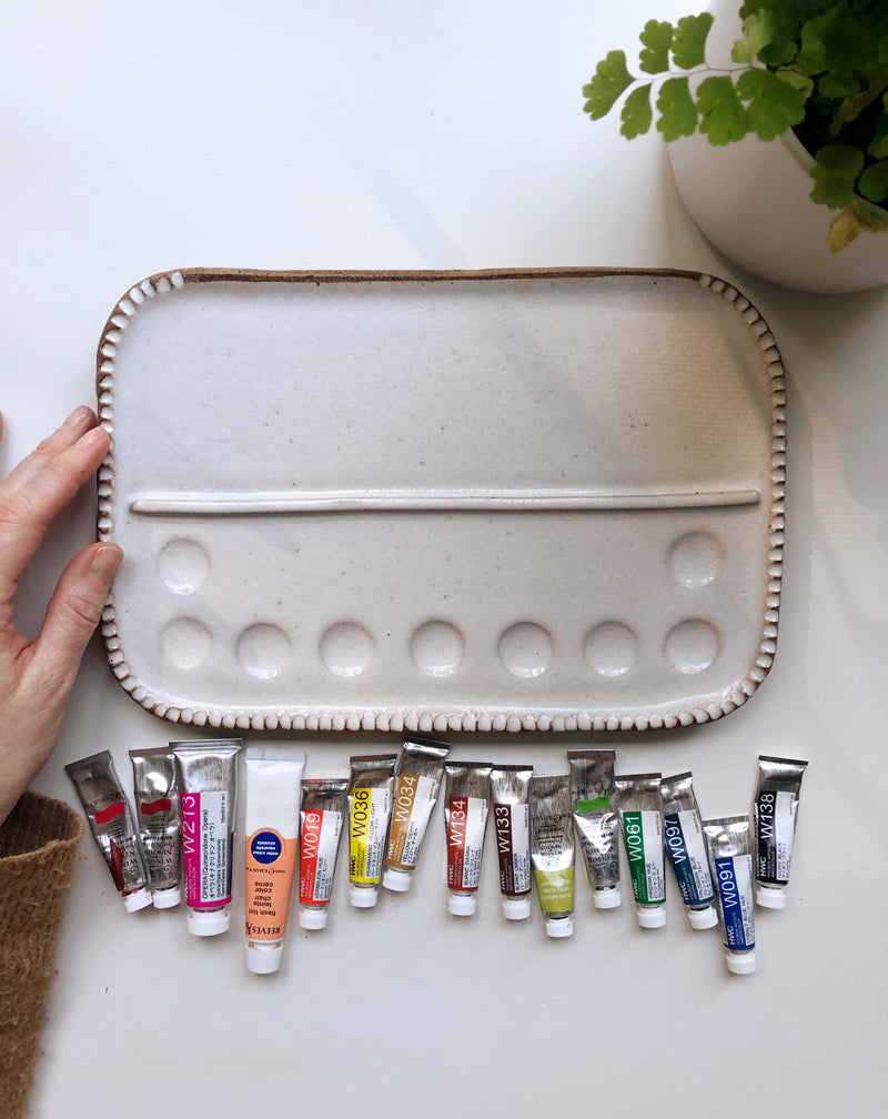
This gorgeous palette is from
Sylvan Clayworks . It is handmade and beautiful in person and I was SO EXCITED when I finally got one! They are restocked every couple of months and sell out in minutes so make sure you join the Sylvan Clayworks email list to be notified first when the restocks happen. I have the
medium palette .
I like an assortment of all colors - reds, peach, yellows, browns, greens, blues, and black and have picked my very favorites to put on my palette. With just a few colors, you can mix almost every other color and I really do love the process of mixing so it works well for me to just have a few options.
P.S. The way tube paints work ... you just squeeze out a little bit on a palette (a dinner plate works great!) and let it dry overnight. To use, just activate the paint with water, mix directly on your palette and when you're done painting for the day, just let it all dry. You can reactivate with water or wipe it off with a wet paper towel if you need more room to mix. You can see below what one of my older palettes looks like:
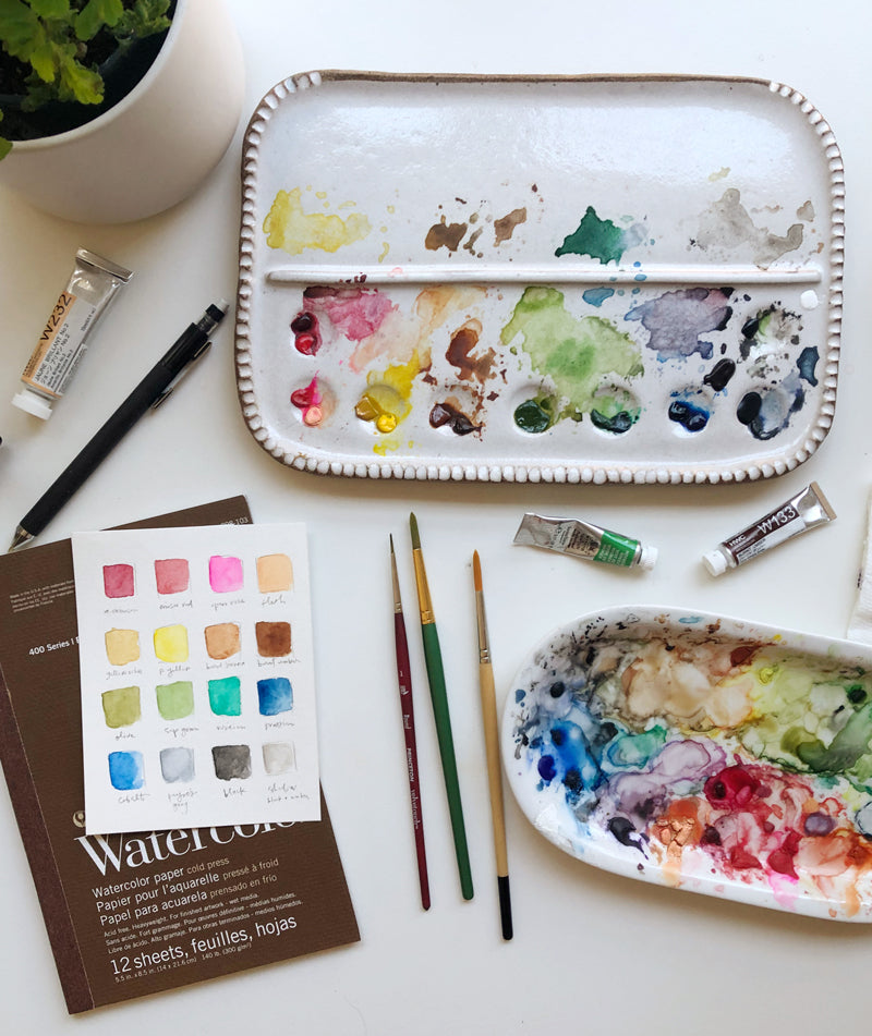
Isn't it pretty?
Okay, back to the current colors on my palette:
favorite paint colors
Winsor & Newton Alizarin Crimson
Winsor & Newton Winsor Red
Holbein Opera Rose
Holbein Jaune Brilliant No.2
Holbein Yellow Ochre
Holbein Permanent Yellow Light
Holbein Burnt Sienna
Holbein Burnt Umber
Winsor & Newton Olive Green
Winsor & Newton Sap Green
Holbein Viridian Hue
Holbein Prussian Blue
Holbein Cobalt Blue Hue
Winsor & Newton Payne's Gray
Holbein Ivory Black
On my color sheet, you can see the last one is called Shadow. This is just my little custom mix of very watered-down black + burnt umber.
Out of all of these colors, my
VERY favorites are Yellow Ochre, Olive Green and Payne's Gray.
I hope this is helpful! Any questions about watercolor paints? I'm always happy to answer!
Choosing a selection results in a full page refresh.
Opens in a new window.
Are you sure? keep only on this device
You have already saved {{itemCount}} of 5 items so you won't be able to save more on this device
Login and sync
Yes, only on this device
Disclaimer: By logging in you are providing your consent to save the wishlist data.